Lots of people have been asking me about inking lately, so I'll try to remember what I learned about it a long time ago and post it here. My first job ever in animation was inking, and there were so many rules to follow that they all had to be written down on a 2 page memo for all the inkers to post up in front of them. I wish I had those now, cause I'd just post them!
So anyhow, here's a picture of the pens I like to ink with best:
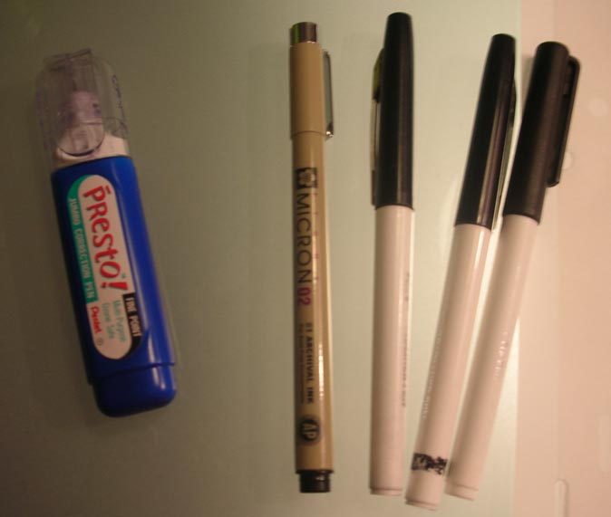 Those black and white pens on the right are "boldliners' made by Eberhard Faber (that's what they're called, right?). I'm pretty sure they don't make them anymore, which is awful because they're the easiest inking pens I've ever used. They're cheap marker pens with felt tips. They're good because when you start out using them, they have nice sharp points, but after a while begin to get mushy at the end, making it easier to put pressure on them to get thicks and thins. There are other felt tip markers you can get, and they work alright too. Then I use Microns for small and delicate lines, and for fixing up any wobbly lines that the boldliners made. The white out is my best friend when inking, because I tend to put my hand right into the wet ink and smear it all over the place.
I had to ink an older drawing a couple of days ago for a poster, so I took a few pictures to show the ink in progress. I don't know if it'll be helpful to the people who asked about inking...I hope so!
 I always start with the thickest lines first, and leave any details for last.
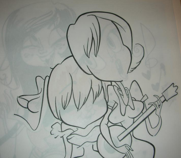 I think that the head on the right girl has nice thicks and thins, but the rest of her body and arms need to be made more consistent...right now all the lines are the same thickness and it's not as interesting looking.
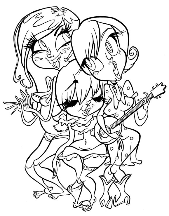 Here's the finished ink, which turned out alright, even though there are some things that could be better...for instance, the place where the middle girl's hip comes too close to the right girl's dress. The lines get all mushy in there, so I'll probably have to fix it later. It's hard to avoid tangents when inking something crowded like this drawing, but I think I avoided some that were in the original drawing.
So here are the rules I remember from when I inked for money!
-Use nice thicks and thins.
-Thick lines are for larger shapes and shapes that are closer to you.
-Thin lines are for smaller shapes and details.
-Details within the drawing, like smile lines or clothes wrinkles, should help to describe the larger shapes that they are a part of.
-Try not to ink inside or outside of the lines, but stay on top of the original drawing.
-Make sure lines follow through. For instance- if I took away the instrument that the girl on the right is holding, the lines on her body and arms should look like they would connect.
-Floating lines, like smile or cheek lines, should go from thin to thick to thin, with the middle being thicker. It looks meatier that way!
-Lines that end should taper to a nice pretty point.
-Pay attention to subtleties in the drawing, and try not to dumb them down when inking over them.